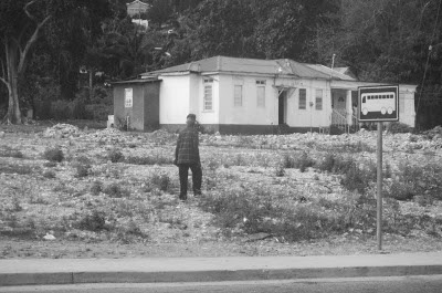
I'll reiterate that I was shooting into the sun, through a window, at x-MPH for the street shots. I came home with bits of color laced with too much light and reflection. Take this photo, for instance:
Keep admiring her; I don't want to give it away....
See the spotted pattern on the path in front of this lady? That is my dress, reflected in the bus window, and the original photo is a hot mess because of it. Strip the color and it's barely noticeable.
I monkeyed with this photo for quite some time, increasing the saturation and converting to black and white, changing brightness and contrast. I almost deleted it, but I like the guy in the yellow pants and purple shirt, so decided to keep.
This was deplorable in color. The lights above is all bus window. Converted to B&W, however, I think it makes this Cigar Club look very "your daddy's rich and your mama's good lookin."
I barely touched this one. You see, the color?
Cropping only on this one too. Taken mid morning, I wish I knew where they were going. Is this a school? A daycare?
This one reminds me of a conversations on the bus: Clint and Ryan talking to one another: "Did you see the steering wheel on the handcart?" And also the women screaming "Bananas! I haven't seen a banana since we got here!"
I love this. I saw so many parents walking their children to schools and highway bus stops, hand-in-hand.
Here's a prime example of why it was so difficult to edit these photos. It's light, it's dark, it's bright, it's drab. This photo is untouched; anything I do to fix one thing skews another. So. It is therefore perfect as is. I like it also just because it was a shot down an alley from a bus going 30 mph.
Snoop Dogg! Celebrity Point for me!
I increased the saturation in this one, but only slightly. I missed the shot I was after, and got more wall than folk. Composition: zilch. Yellow walls, blue shirt, melon tank top, and people standing around talking? I like.
Too bad this one looked better in black and white. The original is blurry and glare-y. Take a gander at his clothing, and imagine how brilliant.
Color untouched. Ridiculous how beautiful, yes?
Color brightened, and contrast tweaked to increase readability. You can see reflection of bus window in the sky on the right:
More street pix to come, and rest assured after that: Pix and tales of the besties. You just wait.


